How to Create Sign Up Form that Will Expand Your Recipient Lists
Forms: although they sound pretty mundane and uninteresting, they actually have a great impact on your marketing campaigns.
The word form actually means: “a printed or typed document with blank spaces for insertion of required or requested information”, but in practice, you can think of the form as a method of efficiently collecting and storing information from your clients, recipients and regular readers.
In other words, the sign up form that you embed in your website, blog or landing page is the first tool (and thus the most important) used to build your recipients list and to collect leads.
Sign up form anatomy
The sign up form is a door used for communication between a marketer and his clients, allowing information to be passed along in a simple manner. You ask for personal information from your clients, and they in return expect to receive a discount, coupons, newsletters, products, etc. You receive a new lead and they get what they were interested in.
The form can allow users to sign up to your newsletters, receive a one-time benefit, download a trial version, first log into the system and much more. Because the form is so important, it must be prominent, well-designed and well-phrased.
Creating sign up forms: where to begin
In the book “Don’t Make Me Think”, Steve Krug insists that: “…it’s probably a good idea to assume that everything is visual noise until proven otherwise”.
Use that as a guideline for designing sign up forms – backgrounds, texts, buttons and everything in-between should be taken into consideration.
Designing a sign up form requires a lot of decision making as the options are endless. First, will the form be based on your company’s colors, or contrarily, be in the exact opposite colors, in order to draw attention? Will the form be at the top or bottom of the page? Left or right? Or will it instead appear as a pop-up when the page loads?
In this case there aren’t any right or wrong answers. You have to do the hard work of checking the different options and their results in the field. If you use ActiveTrail’s system to embed a sign up form in your newsletter or landing page, you can use the “Hot Spots Report” that automatically highlights the statistically “hotter” locations on your campaigns.
Some tips for your first sign up form:
Step 1: Less is more (less fields, more conversions)
How much to ask your users, that’s a pretty important question. On one hand, having more information allows you to focus your marketing efforts. But on the other hand, long sign up forms tire your users and they might just give up.
Think of every question you ask as a one that increases the conflict with your clients and then decide which questions are really necessary. Consider that in most cases you won’t actually need any more than an email address. A study that checked sign up forms containing 11 different fields found that after the number of fields was cut to four, the sign up rate jumped by 160% and conversions increased by 120%!
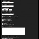
If you aren’t convinced yet, take a look at this sign up form:
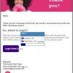
Now take a look at ActiveTrail’s sign up form, what do you think?
Step 2: Text – create expectations
The content of a sign up form should consist of these three components:
1. A short sentence in the beginning or the end – make yourself clear. Try to sell, but keep your integrity. Don’t make promises you can’t keep.
2. Fields – don’t exhaust your clients and don’t be invasive. Ask only for what you must: if you want users to register to a newsletter don’t ask for a phone number.
3. Sign up button – simple and prominent. The text should be clear: “Sign Up”, “Receive Coupon”, and “Purchase” are good examples. You don’t have to be so serious, think of creative ways to get the message across.
Here are some points that will help you draft your text:
- How often does the newsletter go out, weekly or monthly? Consider letting your readers know using the sign up form text.
- What does your newsletter have to offer? Professional help, blog-type content or promotional information?
- What does the newsletter look like? Add a link to a “teaser” newsletter, doing that could increase your conversion rates.
- How many regular subscribers do you have? If that number is impressive, why not use it?
Step 3: What’s next?
We all like to be in control, so don’t give your users the feeling that they’ve lost it. When they click the sign up button they want to know what happens next.
There are a few ways to making your readers feel more connected. Add a few words to your action button: “Start using the trial version now”, for example. You can add text below the sign up button with further information, or use the double opt-in option and use the confirmation email to provide further information.
Two is always better than one
Why create one sign up form when you can create two?
Some of your readers are bound to miss your sign up form. Yoast, for example, uses no less than three different sign up forms, and so far has 96 thousand users signed up, so they must be doing something right.
The first form appears as a pop-up in the website:
The second appears on the right hand side of every page:

And the third appears when you reach the bottom of the page:
By the way, different forms can lead to different places. Different newsletters and different email recipient lists are possible, that way you can be much more targeted on specific clients and their needs.
Bottom Line
A good sign up form is a one that catches your readers’ attentions, calls them to action efficiently and encourages them to be involved. Before creating your own sign up form, take a look at forms offered by different companies and websites and pick which format should work best for you.
Filling in a newsletter sign up form, for example, should not be an exhausting or complicated task. Keep it simple, clear and short. Most importantly, be honest or your clients will never give away their personal information.
Ready to start with your first sign up form? Design your form in the most advanced system in the world – ActiveTrail.


