Preheaders are those magical groups of words that appear beside an email’s subject line in inboxes, and, quite often, they serve as the opening texts in newsletters. How can we make use of Preheaders to improve our campaigns and to cause our recipients to specifically choose to open our emails amongst all the emails they receive?
Amongst the more conventional elements appearing in most email campaigns is the Preheader. The Preheader is the line of text displayed in recipient inboxes alongside an email’s subject line and, in the past, the text was automatically placed at the head of the email campaign, i.e. the very first text of the email itself. At ActiveTrail, we have changed this behavior with our new Preheader feature:
The Preheader Default
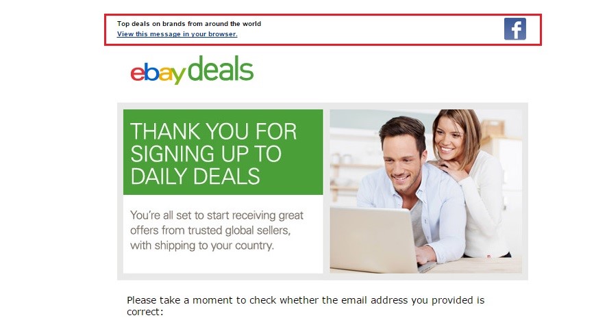
Absent any other setting, the Preheader will constitute, as mentioned, the first text to appear in a campaign, which is usually one of the following: a link to the web version of the campaign; text that appears when the email isn’t displayed correctly; alternative text (alt) you provide for images at the top of your campaign.
Considering the fact that most email service providers display HTML as they see fit, this default behavior seems logical, but it doesn’t have to be this way. The links and practical information are just one approach to making use of the space available in the Preheader. Keep in mind that after some period of time, people may ignore this information because it is overly static. Consequently, it may end up that the text that appears in your subscribers’ inboxes acts as an indistinguishable link or wording that is unrelated to the email’s subject. Conversely, the Preheader, that was very functional in the past as is, can be used to help you increase the opening rates of your campaigns. This is why we, at ActiveTrail, recommend using the Preheader as a short subtitle that briefly describes the content of the campaign.
Using Preheaders as Subtitles
Given that Preheaders are usually viewable in preview windows or in inboxes, as is the case with Gmail, for example, they may serve as a form of subtitle for your campaign that depicts for your subscribers what they can expect in the email. A Preheader’s content, as with the campaign’s content, should be tied to whom your recipients are and to the type of campaign they are expecting. There are many ways to make this work right.
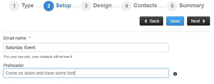
Today, in ActiveTrail, under campaign settings, you are given an option to define a Preheader, such that you don’t have to worry about touching the body of your campaign. Albeit, you should make sure that your subtitle – Preheader is sufficiently long, else some of the text from the body of your campaign may be visible as well.
Everyone and Their Own Preheader
Different campaigns have different Preheaders. With a little bit of thought and even less work, you can adapt your Preheader to a specific recipient or group. In this fashion, for example, you can help avoid unnecessary complaints about SPAM by sending new subscribers campaigns whose Preheaders are written to remind them of when and where they signed up for your campaign. Using ActiveTrail’s automations and dynamic groups, you can send, in a single campaign, different Preheaders to different groups.
You may take this approach one step further, by creating more captivating Preheaders. If certain recipients are being obstinate about opening your campaigns, maybe you should try to encourage them to start viewing your emails again by formulating a more appealing Preheader with a call-to-action to open the email?
The possibilities are endless. All you need to do is to carefully try various Preheader’s and find out what is most suitable for your subscribers.
Placement
We have already established that Preheaders are usually displayed in preview windows. You should, therefore, reconsider where you place them. Preheader texts are often center aligned. This is a strange convention, seeing as preview windows don’t always show the top parts of emails. For example, in Thunderbird and in Hotmail, recipients may use a vertical preview window, such that only the top left part of the campaign is displayed. If the Preheader is center aligned, it may, very well, not be displayed at all.
Similarly, Preheaders are displayed differently on different screens. On desktop systems, the width of a Preheader is displayed in its entirety, or close to it, while on other screens, even email subject lines maybe cut off. Hence, you should account for this when creating your Preheader.
Also, think about using short phrases. Instead of a long winded redirection to the web version of your campaign, you can suffice with a short line such as “Email not displaying properly? Click here.” If you keep your text short, you may be able to pack a few more elements into your Preheader and get more out of it.
Inspiration for Your Preheaders
To cap things off, here is a number of winning Preheaders that will help you understand how these constructs appear on different screens and the significance of their texts when they show up in your subscribers’ inboxes:
For example, in an inbox on a desktop computer:
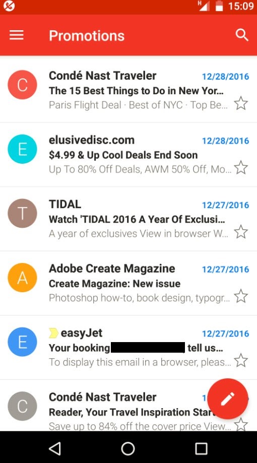
Preheaders (including an email from ActiveTrail) as displayed in Gmail on an Android device (Preheaders are in gray lettering):
So don’t forget to add Preheaders and to word them carefully, just as you would the subjects of your campaigns.
To learn more about sending successful emails, read this article about
15 common email campaign mistakes you should avoid.
Read more on our blog.


