There is an art and a science to crafting compelling and converting emails, and both begin with the email header. An excellent email header draws in the reader’s eye at first glance, enticing them to read on and learn more about whatever it is you’re offering.
The best email headers set the tone for the entire email’s contents and immediately create a visual identity that resonates with your entire brand, as well as with your target audience. According to Science Daily, if visual events don’t reach the brain within 100 milliseconds of being introduced, they will likely wind up unnoticed. There’s no second shot at a first impression, so every millisecond counts towards ensuring your brand sets its best foot forward, is understood, and is trusted to provide whatever product or service you have on offer.
If you’ve been creating and deploying branded emails and newsletters for a while with limited success, perhaps it’s time to empower yourself with a series of email header best practices. Inspire your email newsletter header design by studying some of the leading email header examples in the digi-verse.
Read on to learn more.
What is an email header?
Simply put, email headers form the top part of your email newsletter design. They include a combination of the following elements:
- Branding
- Information about the sender
- The subject of the newsletter, usually in a creative format
- The date of the newsletter released
- Some form of navigation tab
- Various other options that can be included/excluded to meet particular marketing goals
Email headers become the most powerful and effective tool in the digital marketer’s toolkit when leveraged correctly. This is because the header is the first thing your readers will see when opening your email newsletter. As the brain processes visuals 60,000 times faster than they do text, email headers’ design draws the reader’s eye to the email newsletter. It encourages them to delve into the compelling messaging featured in the newsletter’s body.
In short, it’s the hook that lures readers to opt-in to whatever it is you’re selling, so make sure your header is designed to reel in the biggest possible catch with eye-catching email header ideas.
What is the difference between email headers and preheaders?
As mentioned above, email headers appear at the very top of email newsletters. They are highly visual pieces of marketing real estate that can – and should – be designed to shine.
Conversely, the preheader is the short email excerpt is featured alongside the newsletter’s subject line and email address. Typically, the preheader takes the shape of a single phrase or segment of a sentence that describes the following email in the shortest possible way to pique readers’ interest, so they open the email and opt-in. It is marketing copy in its plainest form, without any graphics or links to click through.
While the header is the eye-candy that encourages engagement, it is the preheader that guides readers to open the email and view the header in the first place; do not discount this small but highly influential piece of digital real estate!
Why is it important to customize your email headers?
The best newsletter headers convey your brand’s voice, mission, and messaging with a single look. A carefully crafted email header image provides context for the body of the email to come, increasing the odds that the reader will scroll through, instead of sending your email newsletter to the trash.
This is particularly critical, given the vast amount of emails sent and received each day: 293.6 billion in 2019, a number that is expected to surge to a whopping 333.2 billion in 2022. Either you stand out by customizing your email headers, or you risk your email newsletters being swallowed by the massive influx of daily emails your readers already receive and consider to be spam.
Best practices for email header design
To customize your email headers for the win, consider including the following best practices:
- Add a logo to your header – Doing so ensures your readers immediately know who the email is from, and adding animated logos with contrasting backgrounds can help excite the eye. That said, make sure your animations and/or GIFs remain under 1MB in size so that your email loading time isn’t severely impacted.
- Add a navigation menu – When a clear and concise navigation menu is presented, readers feel more comfortable scrolling through your email newsletter. However, when too many buttons overburden the navigation menu, it only increases confusion. Consider A/B testing a couple of options to find the right balance.
- Use anchors to refer readers from one part of the email to another – The more you help your readers navigate your email newsletter, the more likely they are to read it in full and click through to your website.
- Ensure your header text is aligned with the email’s subject line and preheader – These separate elements work best when they are aligned with each other and reinforce each others’ messages. As the old adage goes, “if at first, you don’t succeed, try, try, try again.”
- Include social icons and a button to “view in browser” – While some brands opt to include links to their website and social pages in the email’s footer, placing them in the header is actually far more visible and accessible, especially when the email contains other visuals or interactive elements that make the entire newsletter heavier and take longer-to-load.
- Go mobile – These days, customers consume content anytime and anywhere, including from their smartphones. Email newsletters that are designed to be mobile responsive are more likely to be opened and read. Conversely, emails that display poorly are likely to be deleted in as little as three seconds, regardless of how great the content may be.
- For B2C brands, add a “store finder” button” – This is a great option to encourage readers to visit your physical stores and try on or out specific merchandise advertised in the email newsletter.
- Include special offers and/or promotions – Creating a link with a particular offer or value proposition, such as free shipping on orders over a certain amount, not only helps encourage readers to purchase, but it also makes it easier for them to complete their purchase without having to open new tabs and navigate through your site to find what they want.
Top 5 email header samples to inspire your next email campaign
Now that you know which best practices to implement, here are some email header design examples from brands who did so with style and success.
#1 – edx tells it like it is
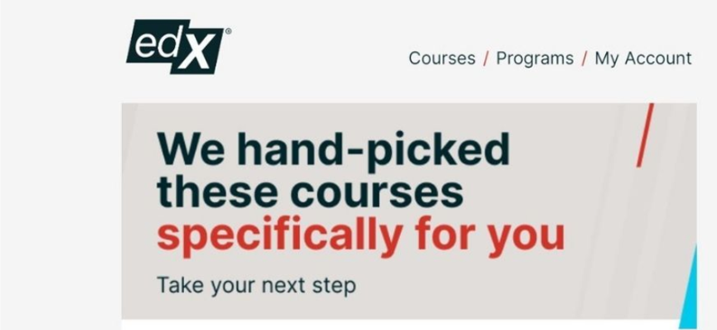
At first glance, this email header may seem simple and subdued, but in fact, it is extremely powerful. With its logo, three-option navigation menu, a simple explanation, and an accompanying call to action, edx exudes clarity, ease of use, and, most importantly, personalization. This is perhaps the most minimalistic, yet inviting header we have seen.
No header image. No wild color scheme. Just a promise and an invite to take them up on it, no frills attached.
#2 – Nike’s header image speaks for itself

In stark contrast to the example above, Nike’s header image is a bare-bones newsletter header example that lets the visuals do the talking. While ostensibly this example may seem to contradict all of the best practices for email header design outlined above, in reality, it does not.
When branding is this good, the message is transmitted, even without words.
This image creates a dialogue between the two models, and the Nike Swoosh logo clearly indicates that the brand is behind this email newsletter. The image’s energy is so powerful that one cannot help but wonder what the models are thinking about or doing, motivating the reader to keep scrolling down.
Couple this one with a concise preheader, and no doubt will remain as to what the particular email newsletter contains.
#3 – AFAR champions all the best practices
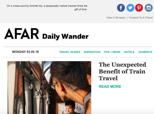
AFAR makes sure its readers don’t have to look far to understand precisely what their email newsletter is all about. By juxtaposing the preheader just above the header, and integrating all of the best practices outlined above (social buttons, “view in browser” button, simple navigation menu, date of publication, great image, and a catchy hook with a built-in CTA), AFAR ensures that the goal of their correspondence is clear and that readers can access everything they need to opt-in.
#4 – Marco Polo Hotels makes it personal
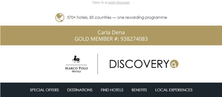
This email header example, courtesy of Marco Polo Hotels’ Discovery Program, adds another layer of personalization by including the recipient’s name and member ID. In doing so, the hotelier instantly transforms correspondence from yet another “flyer” to messaging less likely to be chucked before being opened.
The more you personalize your email, including its header, the more the reader will feel that added value is directed at them, causing them to feel more invested in opening and reading its content. It’s such a simple move that creates such a great impression.
#5 – J. Crew keeps the eye moving down the page
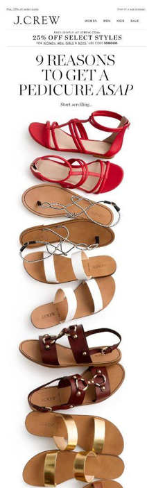
With its long email header image that undeniably lures the eye downward towards compelling CTA, J. Crew successfully motivates the reader to scroll through the entire email newsletter without a second thought. Unlike most email headers that are horizontal in nature, this vertical email newsletter example accomplishes more with a simple image than others do with paragraphs upon paragraphs of compelling copy. From the exclusive offer presented at the header’s top, through the tantalizing title atop a long line of colorful footwear, to the social buttons that tease “share your sandal feet” without ever uttering a word, this is an email header to emulate – and beat!
It’s simple, highly visual, enticing content in a bite-sized format; precisely what your next email campaign needs to succeed.
Bottom line
While it’s true that there is no single “best email header” to copy and implement for your every marketing campaign, adhering to the best practices and drawing inspiration from the examples outlined below can help you on your way to deploying email newsletters that convert.
Our email newsletter software further enhances your email header design results by automating every step of your marketing email journey. From lead generation and predictive delivery to email templates and advanced analytics, we help ensure that your email header designs achieve the level of visibility and results you crave to promote a better bottom line.
Want to automate your email newsletters with ActiveTrail? Talk to us about a free trial today!