The digital marketing world is divided into two: those who treat popups and registration forms as quite the nuisance and rush to close them; and those who understand it can be a significant marketing asset for increasing engagement on the brand’s website. The truth is somewhere in between: popping popups can indeed badger users, but even in 2023 you need to know how to use them wisely.
The role of the popups and registration forms is quite clear: strengthening the relationship with users in real time, in order to achieve goals such as: registering for a brand’s newsletter, signing for promotions, joining a loyalty program, promoting new products and more. However, even if the target bank is known beforehand to both parties, marketers still need to comply with the unwritten agreement – peace for quiet. As long as users enjoy a quiet and enjoyable content, they will silently allow advertisement breaks or sharing of browsing details. Violation of the above agreement on the marketers’ part, can lead to proactive blindness to any engagement call, and to users leaving the website.
The question to ask now is: how not to annoy your users? How to not make them curse and run for the X sign above the registration form? We have some ideas for you, but first, you should answer these questions:
Is timing overrated?
Yes, this sentence is also relevant here. Most websites use popups immediately upon entry or shortly after. Well, that’s a mistake. Why not use them at the end? Just before they leave the website, or at the moment they leave? Thinking that if they are already out then why bother, is actually wrong, since they might appreciate the fact that the marketer allowed them to browse peacefully and waited, out of politeness, with their value proposition until they were about to leave.
What do I actually want to know?
Surveys are a great way to increase user engagement in the immediate run. They can appear in the form of questions or a chat, checking purchasing or browsing experience in the website. It’s important to remember that asking questions can be perceived as a breach of privacy, so we recommend asking only essential information, and not information that might deter users or make them worry about the brand.
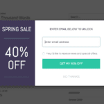
Popups strengthen the involvement of the users (Screenshot)
What’s the popups’ purpose?
The stage of defining the popups’ goals is critical to their success for a simple reason: each goal require a different type of popup, visibility and tone. What information should be presented? When? Where? Where will the popup lead users who clicked the form? All these questions are very important, and will help with the initial characterization of the form. They will also help you understand browsing experience on the website, the way users experience it.
Which popup should you use now?
As mentioned above, each popup has a different purpose. Collecting leads? Create a clean form with a catchy and clear message with an incentive to register. Promoting new products? The graphics are extremely important here, and should be attractive and raise interest very quickly. Handing out coupons? Why not go for an animated ruffle button, and each time a user clicks it will generate a coupon? The more intriguing and interesting the form – the greater the chance of users getting involved, and signing up to the mailing list.
Why would users cooperate now?
It’s not easy creating cooperation of users with a brand they know, and even less so with a new brand. One way to counteract users’ tendency to stall, is to create a sense of urgency in each form. True, some think that timers are passé, but they still work, playing us all like a consumers’ fiddle. Limiting the number of products or buyers, can press a few buttons on the way to the Holy Grail of getting credit card details.
What experience do you want to convey to users?
Of course everyone wants to provide a good browsing experience, but not everyone always fully understands it. This is because many brands don’t understand the browsing experience on their sales website. Where do users come from? Where are they heading? How long do they stay on each page? What actions do they perform? Answering all these questions will allow you to maintain a positive flow, and an organic integration of the forms in the website, without disrupting or delaying reading.


