When you get to work on creating a new landing page, there are a lot of things you have to think about.
What’s my objective for the campaign? What do I want to get the users to do? How do I want to design my landing page?
When you’re looking for inspiration, don’t be afraid to follow others!
A successful and unique landing page will boost your conversion rate, help make your campaign successful, and of course benefit your brand.
In order to approach this challenging task, you need to get some inspiration from what’s happening on the web – that way you’ll understand what great landing pages are made of and you’ll be able to build one like that yourselves.
For that reason we wrote this post for you, focusing on 5 impressive examples of great landing pages that we recommend following (and one extra bonus example).
Read, internalize, implement, and see how your conversion rate shoots up – because there’s nothing like learning from the people who know how it’s done!
1. Muzli
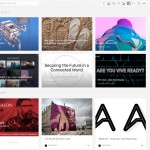
There’s nothing like Muzli, we at ActiveTrail are crazy about this plugin. It’s a plugin for Chrome that incorporates all kinds of blogs about UX design, illustrations, digital art, and more.
Muzli’s homepage is also Muzli’s landing page, and it also looks like the plugin itself. The uniform appearance of the design, together with the brand’s color, which is stand-out fuchsia, contributes to the branding and indentification of Muzli.
2. Pinterest
Another application whose homepage is a landing page is Pinterest. Pinterest has a moving background and the sign-up form design changes every time you log in – with a different creative each time.
The sign-up form really stands out and Pinterest even mentions how many seconds it takes to sign up –15 seconds flat!
None of us likes to waste our time on long and frustrating registrations and Pinterest understands that. Make sure your sign-up procedure is short and to the point and don’t hesitate to let your users know about it! There’s a good chance it will motivate them to sign up.
P.S.
It’s a little addictive, logging in to Pinterest’s landing page to see their new creative each time. One time it tells about someone who used Pinterest to rebuild his floors and another time about someone who used Pinterest to develop his diving skills.
After we clicked a lot of times, we discovered that examples of women who use Pinterest appear relatively infrequently, and according to Pinterest they use the web to learn how to make pasta and to upgrade their style. This may be because most of Pinterest’s users are women to begin with, but we would expect Pinterest to be a little more advanced as far as gender is concerned.
3. DropBox Business
DropBox’s design is altogether wonderful, and there, too, the homepage is a kind of landing page and it’s quite a few scrolls long with a few Call-to-Action buttons. That being said, the landing page we wanted to talk about is that of DropBox Business, a similar but slightly different DropBox platform, which – you guessed it – is meant for businesses.
The design of this page is excellent; DropBox retains a clear design language that’s identifiable with Dropbox and on the landing page there’s a prominent Call-to-Action and inviting, confidence-building copy. Another element that’s on this page is the logos of major businesses that use DropBox.
When you have big, impressive customers like these, it’s great to show it on the landing page so users will think to themselves – if National Geographic uses DropBox, how can we not use it? (We purposely didn’t say Yahoo, we probably wouldn’t use Yahoo in any case).
What can be learned from DropBox Business’s landing page:
- Pleasing design can be minimalistic
- Words plant feelings – The copy builds confidence and suits the feeling of security that DropBox wants to instill in its users.
- If you have big customers and lots of businesses that use the product – it’s a good idea to mention it.
4. Bigstock Photo
The image stockpile company has a landing page for signing up for a free trial that it gives new users, which gives us a pretty good example of the elements that can be included in landing pages. Indeed, it seems that Bigstock used every trick in the book to build an effective landing page, instead of using only one, but in the end the result is pretty good, even if a bit messy.
On its landing page Bigstock presents a video, a short explanation with accompanying graphics about why it’s worthwhile to use them, images from their vast collection, logos of customers who liked them, and customers’ opinions. Each of these elements is interesting and is an addition that totally upgrades the landing page. Personal opinions, for example, are excellent because they tell the user that she’s not alone, that there are already people who use the product, and like it so much that they’re willing to tell anyone who’s interested.
So here’s what we learned from Bigstock:
- A video on a landing page is a nice, refreshing addition
- If you have a visual product, don’t hesitate to present it in all kinds of ways
5. Shopify
The platform for building an internet shop grants a free 14-day trial period for building your online shop. The landing page that was built for that purpose is designed in a relatively simple but effective manner. The page notes the main details that need to be known about the platform, the main features, and the lowest price available for purchasing the product.
Besides that, Shopify notes the number of businesses around the world that use the system, and at the bottom of the page it shows the press companies that granted it media exposure, using the logos of those press companies. It’s an interesting choice, since Shopify could easily replace them with the logos of some of their customers who built shops with their help (there are, after all, some 200,000).
Maybe because Shopify has many famous customers, and they didn’t want to advertise some of them and not others, possibly for reasons of confidentiality, or perhaps for entirely different reasons, Shopify chose to show the logos of press companies instead of those of customers, a choice that is no less effective and gives us something to learn from.
6. Bonus – ActiveTrail’s landing page
Although it’s not particularly modest on our part, we really believe that we’re good at building landing pages, otherwise we couldn’t write to you about it. The following landing page of ours demonstrates the main characteristics of our landing page system and it includes a video, logos of our customers, and recommendations by the experts. These elements are convincing, as is our prominent Call-to-Action and the explanation about ActiveTrail.
These are only a few examples of effective landing pages, but there’s a lot to be learned from them.
Of course, every page is unique and the possibilities are as boundless as the imagination, but we can still extract some main features of effective landing pages:
- Intriguing and tempting copy (Muzli)
- Special, ever-changing design (Pinterest)
- Prominent Calls-to-Action (Pinterest, ActiveTrail)
- Mention of press companies (Shopify)
- Integration of videos (Bigstock, ActiveTrail)
- The use of the brand’s colors (Muzli, DropBox)
- Mention of well-known customers (DropBox, ActiveTrail)
Now you’ve got inspiration. So go ahead, get to work!
We’ve already written to you explanations on how to built a landing page that converts, how to remarket using a landing page, and more.
If you’re building a landing page and you’re still not familiar with all these guides – it’s about time.


