ActiveTrail’s email templates allow brands to reach a cohesive language, pinpoint marketing messages and create great looking campaigns. However, specific versions of the Microsoft Outlook email software do not support some emails and newsletters.
Outlook has many versions, among them Outlook 2007 which is not supported by ActiveTrail at all (that means your emails may or may not appear correctly, but we don’t have the possibility to provide tech support for them), and Outlook 2010, which is mostly supported by ActiveTrail but has a recurring problem with distorting some emails and showing the mobile-optimized version on desktop.
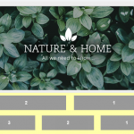
For Example, This is what your newsletter looks in ActiveTrail before sending:
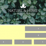
And this is how the recipient will see the same newsletter if he opens it in Outlook 2010.
The shift in the blocks is an internal problem of the Outlook application that can not be solved by ActiveTrail. There are, however, several problems which can be solved entirely or fixed temporarily.
Who uses Outlook nowadays?
With the rise of Google’s popular email service, the use of Outlook as an email application is not as widespread as it was in the past. Despite that, ActiveTrail’s internal data analysis shows that there still is a substantial part of recipients who open their email with Outlook. The best way to test how your emails will look in Outlook is by setting up an Outlook email address and using it to check the appearance of your campaigns.
It should also be said that many recipients who still use Outlook as their Email application are aware of their display problem (it’s not only your emails that look wrong) and take it into account when they choose to continue using it.
We made a list with several problems your subscribers can encounter when they open emails with Outlook and how to solve or override them.
GIFs don’t work
Sadly, Outlook doesn’t play GIF videos. Ever. We recommend choosing GIFs with a first frame that carries through the meaning of your visual message or opting for a still image if a large percentage of your recipients are Outlook users.
Text sticks together and overlays the image
Outlook may ignore the spaces between content blocks and image blocks in your newsletters and “stick together” text and visual. Sometimes the two appear to be too close together, and sometimes text and image appear one on top of the other. This can be solved by adding a frame in the newsletter background colors to the pictures and making sure they are placed correctly with a test email. This way, even if the text moves closer to the image, it still appears aligned. Just don’t make the spaces too big for other email users.
The round button of CTA is square
All buttons appear rectangular in Outlook. There’s no way to change that.
General campaign appearance issues
As Outlook renders HTML through Microsoft Word, there are sometimes other small glitches in appearance. Technically speaking, we can compare Outlook with the printers “preview” mode and how it presents content files – the alignment isn’t always optimal. While your newsletter is a single page of scrollable content, Outlook processes it as if it was divided into separate pages. As we already mentioned, most of these issues occur in Outlook 2007 and Outlook 2010, but newer versions don’t always receive emails in the exact way you designed them either. Recipients may, for example, encounter instances when content blocks shift slightly up, down or to the sides.
To sum up, keep in mind that not all Outlook users encounter the appearance issues mentioned in this article. There are people in your mailing lists who never came across an email garbled by their email software. However, when you send test emails to yourselves, we recommend testing them in Outlook as well, especially if you know of clients who use this software.
Read more:
A Guide to Improving User Experience on Your eCommerce Site
5 Strategies to Boost Engagement Using a Marketing Automation Software


