How to Design Signup Forms that Convert Like Crazy
Signup forms are the gateways for visitors to become your subscribers. It’s usually a small box that can be filled out by interested viewers with the information you need such as their names and email address. All the inputs from the signup forms will then be added to your database.
There are different types of signup forms that you can use to maximize the chances to convert your website visitors into subscribers.
A floating signup form – stays on the screen of your visitors as they scroll through your page. This way, they can easily subscribe no matter where they are on your website.
- A pop-up form – appears only after a few seconds or minutes a viewer stayed on your website. This will ensure that your viewer will notice your signup form. You can choose to occupy the whole screen or just a small box that appears on the lower corner of your viewer’s screen.
- You can also embed static forms on different parts of your website, such as the feature box, sidebar, and footer.
Signup forms must be designed beautifully. It also needs to be catchy enough to compel visitors to take the action you want them to – sign up! User experience should be your priority when designing Email signup forms. Below are design tips and tricks in creating signup forms that effectively converts.
Signup form design tips and tricks
1. Short and Powerful
Only include fields which are absolutely necessary like names and emails. If you need to ask for more information for your email segmentation, give them a reward in exchange.
ActiveTrail’s signup form only includes name and email fields:
2. Provide a Clear Value Proposition
Let your visitors know what they are getting when they subscribe; honestly.
HubSpot’s signup form clearly states that you will receive marketing articles when you subscribe.
3. Show your Social Proof
Let your subscribers feel that they are not alone in giving away their names and emails. Show them that they belong to a large crowd.
This signup form of Problogger includes the number of their readers which is a great way to show social proof.
4. Use attractive and high-quality graphics
Aesthetic appeal matters in every part of your website. More so in your signup form because you are asking your viewers to trust you with their personal information.
This signup form of Reader’s Digest includes a graphic related to the newsletter.
5. Go for a single column
Studies have shown that single column forms have higher conversion rates.
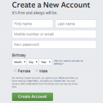
Facebook’s signup form is in a single column with clear labels.
6. Use short and clear labels on your fields
Do not let your viewers think twice to understand what you are asking; they might just leave instead of trying to understand your labels.
7. Align labels on top of field boxes
This makes it clearer and easier for your visitors to fill with the information asked.
8. Specify what happens next on your action button.
Avoid words like submit and click here, instead, use words like subscribe now and create my free account.
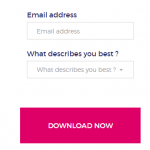
The CTA button of Presta Shop specifies what action will happen when you click it. The color is striking and aligned with its brand personality.
9. Use a striking button color that is aligned with your brand personality
Your action button must easily be noticed, it must have a contrasting color with the rest of the signup form.
10. Include smart defaults
Help out your viewers fill out your form with default answers for them to complete and submit faster.
Wrap up
Signup forms that are ideal for conversions are easy to understand, fill out, and submit. The more you ask your viewers to do, the more chances they will leave your website without subscribing. Follow the design tips above and watch your email list grow!
ActiveTrail includes a variety of beautifully designed signup form templates for different industries and niches.


